Brand guidelines · v1.0 · 2026
Built Around Life. One identity across every exterior system.
This page is the working reference for the NeoLine Composites identity: logo lockups, the icon, colour, typography, the pillars behind our messaging and the rationale that keeps the brand consistent from spec sheet to storefront.
Positioning
Architectural exterior systems, engineered for Canadian living.
Mission
To create durable, design-led exterior systems that give people more beautiful spaces, greater privacy and less maintenance, engineered for the way Canadians live.
Vision
To become Canada's most trusted composite exterior systems brand.
Brand promise
Modern exterior design that performs beyond the season.
Customer proposition
A coordinated system of fencing, gates, decking and siding, supported from design through installation.
01 · Logo
The horizontal lockup is the default.





Clear space & minimum size
- Clear space on all sides equals the height of the icon's smallest block.
- Minimum digital width: 120 px horizontal, 64 px vertical, 24 px icon.
- In the site header the lockup is white type with the lime icon.
Misuse
- Do not recolour the icon outside lime, ink or white.
- Do not stretch, rotate, outline, add shadow or gradient.
- Do not place the lockup on busy photography without a scrim.
- Do not rebuild the wordmark in a substitute typeface.
02 · Colour
Lime, ink and paper. Support tones stay mineral.
NeoLine Lime
#BDE559
Primary brand accent. Icon, focus words, CTAs.
Composite Ink
#0B0B0B
Primary dark. Backgrounds, wordmark, body type.
Warm Paper
#F5F2EA
Primary light surface. Editorial sections.
Deep Evergreen
#14382A
Depth accent for landscape and system diagrams.
Mineral Charcoal
#2E3330
Secondary dark surface, technical panels.
Coastal Mist
#C7CEC8
Dividers, muted labels, spec tables.
Timber Warm
#A9814F
Product-tone pairing for Honey Oak profiles.
Lime Deep
#6E9427
Accessible accent for accent text on light surfaces.
Lime is an accent, not a surface wash. Use it for the icon, focus words, primary buttons and data highlights. Product colours are reproduced accurately and are never tinted by brand filters.
03 · Typography
One modern grotesk, used with discipline.
Primary typeface · Oakes Grotesk (web fallback: Figtree)
AaBbCc 0123
Headlines set tight: -0.035em tracking, 0.95–1.05 line height, sentence case, balanced wrapping. Never all-caps at display sizes.
Display
clamp 2–4.9rem · 600 · -0.035em
Section heading
clamp 1.6–2.4rem · 600
Body
1.0–1.125rem · 400 · 1.7 line height
Eyebrow / UI label
0.75rem minimum · 600 · uppercase
Minimum supporting copy
Supporting descriptions use 1rem as the standard size. Compact captions and secondary metadata never fall below 0.875rem.
Interface labels
Navigation, buttons, overlines and interface labels use a 0.75rem minimum with clear spacing and strong contrast.
04 · Brand pillars
Five pillars carry every message.
01
Designed Privacy
Create calm, separation and security without sacrificing style.
Visual direction, Wide architectural compositions, layered landscape, controlled sightlines.
02
Canadian Performance
Made for rain, cold, heat, sun and daily use.
Visual direction, Seasonal transitions, coastal environments, freeze-thaw detail, real projects.
03
System Thinking
Fence, gate, deck and cladding work as one exterior language.
Visual direction, Material palettes, coordinated colours, exploded system diagrams.
04
Proof Over Promises
Show tests, tolerances, installation, warranty and completed projects.
Visual direction, Macro material imagery, technical overlays, installer testimony.
05
Life With Less Upkeep
More time using the space, less time maintaining it.
Visual direction, Human moments, clean surfaces, restrained copy, no maintenance clichés.
Fencing frames. Gates arrive. Decking occupies. Siding identifies.
One exterior language
05 · Unique selling points
What we lead with, in order.
25-year residential warranty
Documented coverage on capped composite systems.
Capped co-extrusion
A protective shell engineered against fade, scratch and moisture.
One coordinated system
Fencing, gates, decking and siding specified as a single language.
Zero staining or sealing
No annual refinishing cycle across the service life.
Engineered for Canada
Freeze-thaw, coastal moisture, UV and snow loading.
Design-through-install support
Specification files, samples and installer guidance.
06 · Brand rationale
Engineered and natural at the same time.
The composite category looks interchangeable: close-up woodgrain, isolated boards, generic backyards, leaf icons and broad durability claims. NeoLine moves from material advertising to architectural outcome storytelling, showing how exterior boundaries become designed spaces. The identity avoids eco clichés: no leaf symbols, no bright green gradients, no rustic textures, no crowded sustainability badges.
Logo rationale
The three forms express the idea behind composites: separate elements becoming stronger through combination. Each block is simple on its own. Together they create a bold, engineered N, reflecting NeoLine's move toward design-led exterior systems built with durability, precision and purpose.
The progression also makes the mark future-facing. Three forms can become four, five or many, just as NeoLine can grow from fencing into gates, decking, siding and new categories over time. The identity is not tied to one product. It is a visual system built to expand. One language. More possibilities.
Tone of voice
Direct, composed, informed and specific. Replace "best" and "premium" with evidence wherever possible. Proof-led sentences, no exclamation marks.
Motion & photography
Slow, precise movement; material reveals; sliding panels; seasonal transitions. Real Canadian projects with wide architectural framing and human scale.
Architectural clarity
Strong grids, generous negative space, controlled alignment, full-bleed project photography.
Material intelligence
Profiles, surfaces, joints and component relationships shown with disciplined macro imagery.
Quiet confidence
Concise headlines and proof-led supporting copy rather than exaggerated claims.
Canadian modernism
Coastal restraint, concrete, timber tones, charcoal and mist, never rustic.
System consistency
One visual grammar across products, samples, technical sheets and dealer displays.
Digital utility
Legibility, comparison, specifications, filters and mobile quote conversion first.
07 · Brand in use
Ink, lime and one lockup, applied consistently.
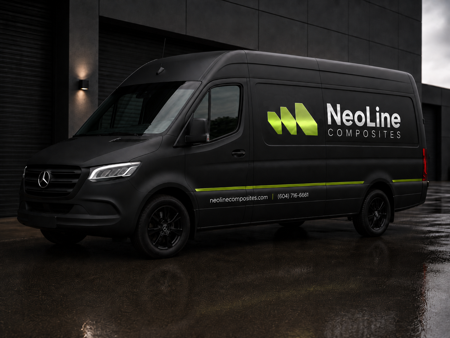
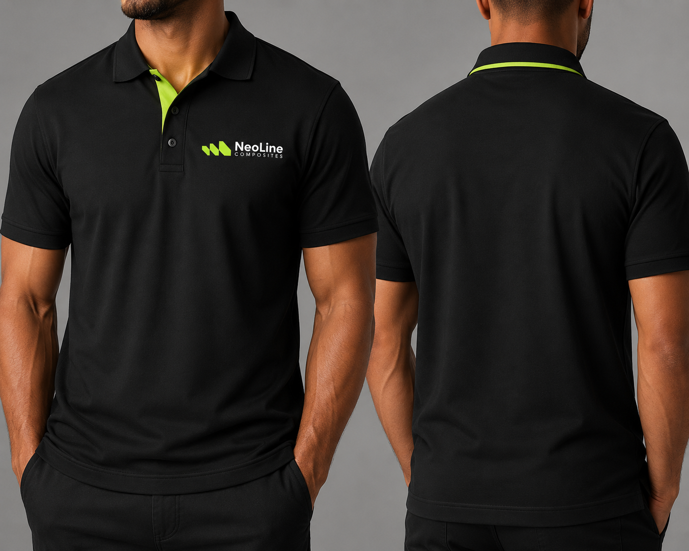
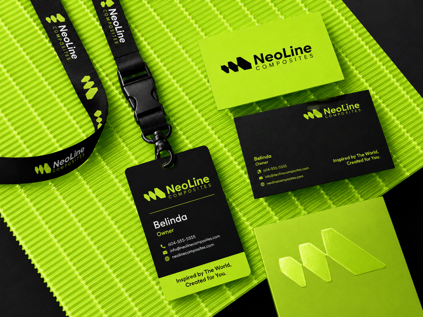
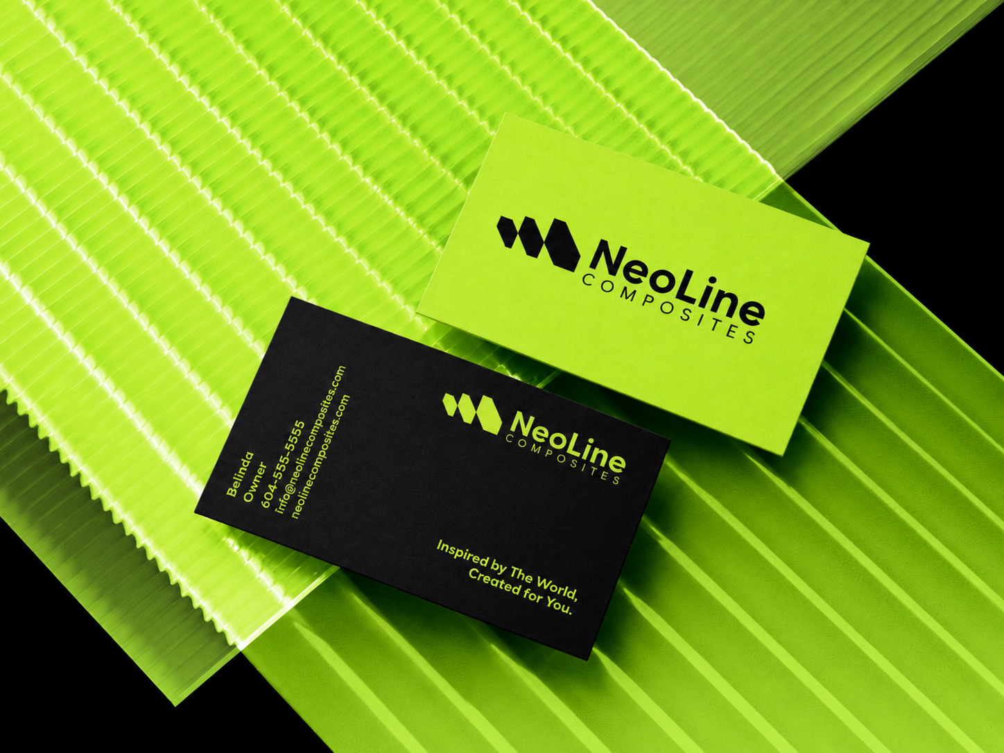
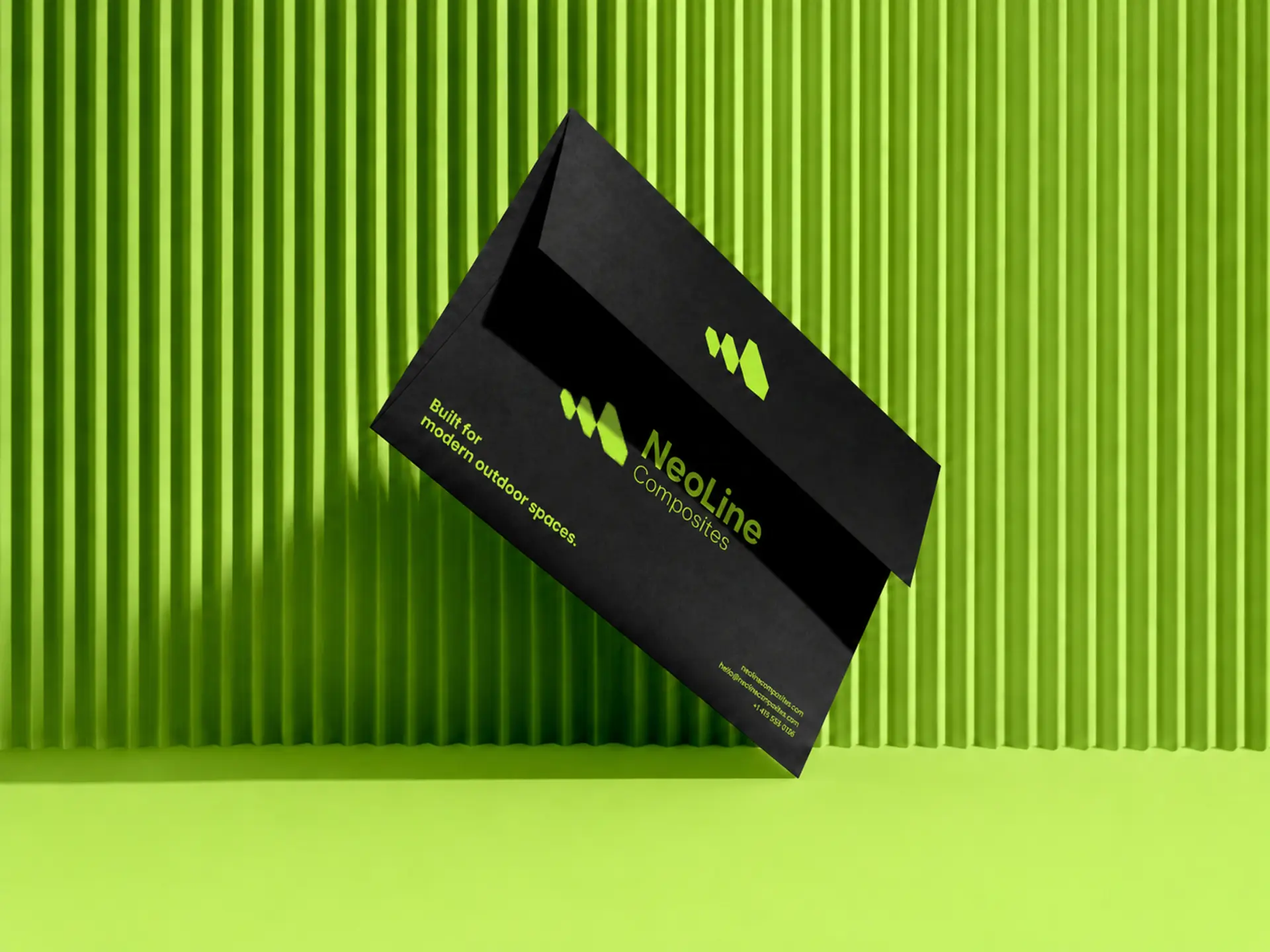
Reference applications across apparel, stationery, print collateral and retail merchandising. Ink is the default carrier; lime appears as accent, edge or single full-bleed surface, never both at once.